
Right now, a visitor is stuck on your site. A button won’t read, a menu won’t open, a form won’t submit. They leave silently, and your reports never show it. Here’s how to check website accessibility in 2027: scan, test by keyboard, zoom, and mobile, then fix what blocks buyers first.
Why Should You Check Website Accessibility in 2027?
Because most websites fail, and visitors quietly leave when they do.
The 2026 WebAIM Million study scanned one million home pages. It found 95.9% had detectable WCAG failures, averaging 56.1 errors per page. That’s the first step backward in six years. Low contrast text, missing alt text, and unlabeled form fields led the list. Here’s a fresh 2027 angle. Errors rose 10.1% in one year, while page elements grew 22.5%. Pages are getting heavier faster than teams are fixing them. And AI shopping agents read the same accessibility tree that screen readers do, so broken markup now hides you from machines too.
The audience is also bigger than most owners think. The CDC reports that roughly 1 in 4 US adults lives with a disability. That includes vision, hearing, mobility, and cognitive differences. Here is the honest part. Accessibility isn’t charity. It’s usability for everyone: the parent holding a baby, the person squinting at a phone in sunlight, the customer with a broken wrist. When you check website accessibility early, you protect revenue, reputation, and legal standing. You also catch UX problems you didn’t know existed.
What’s the Difference Between an Accessibility Audit and a UX Audit?
They overlap, but they ask different questions.
An accessibility audit asks, “Can everyone perceive, operate, and understand this site?” It measures your pages against standards like WCAG, the Web Content Accessibility Guidelines. A website UX audit is broader. It asks, “Does the whole experience work for our visitors and our business goals?” It reviews:
- Navigation and information architecture
- Content clarity and page layout
- Visual hierarchy and calls to action
- Analytics, heatmaps, and drop-off points
- Mobile experience and page speed
- Trust signals and conversion paths
A website usability audit is a narrower part of that work. It focuses only on whether people can complete specific tasks, such as finding a price, booking a call, or paying at checkout. It usually involves task-based testing and scoring friction points.
Simple way to remember it:
- Usability audit → Can people finish the task?
- UX audit → Is the whole journey effective and pleasant?
- Accessibility audit → Can everyone do both?
| Factor | Accessibility Audit | UX Audit | Combined Audit |
|---|---|---|---|
| Main question | Can everyone use it? | Does the full experience support users and business goals? | Can everyone use it easily? |
| Benchmark | WCAG 2.2 AA | Heuristics, analytics, user tests | Both |
| Typical output | Pass/fail issues by criterion | Friction points, flow maps | Scored, prioritized roadmap |
| Key methods | Scans, keyboard, screen readers | Heuristic review, analytics, usability tests, heatmaps | All of the above |
| Business payoff | Lower legal risk, wider reach | Higher conversion rates | Both, with shared fixes |
| Best for | Compliance-sensitive sites | Sites with weak conversions | Most business websites |
My advice: don’t run them separately. A single combined pass saves time and shows where one fix solves two problems.
How Do You Check Website Accessibility Step by Step?
Follow this order. It moves from fast and broad to slow and deep.
- Define scope. List your top 10 pages and 3 key journeys.
- Run automated scans.
- Test by keyboard.
- Test with a screen reader.
- Check zoom, mobile, and browsers.
- Review content and cognitive load.
- Score, prioritize, and report.
Start with automated scans
Tools find the easy wins fast. The W3C maintains a searchable list of evaluation tools. Deque’s axe is a popular free engine many developers already trust.
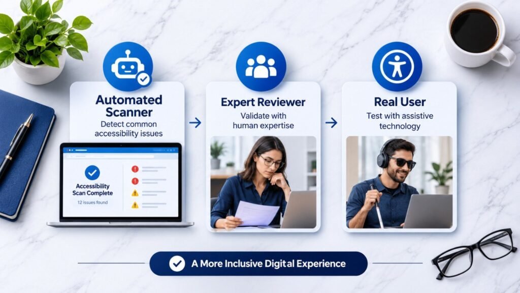
But don’t stop there. Automated tools catch only a portion of real issues, often estimated at 30–40%. They can’t tell if alt text is meaningful or if a flow makes sense.
Move on to manual checks
WebAIM’s evaluation guide is a great manual walkthrough. It covers structure, images, forms, and keyboard behavior in plain language.
| Method | Pros | Cons |
|---|---|---|
| Automated scan | Fast, cheap, repeatable | Misses context and logic issues |
| Manual expert review | Catches nuance and real barriers | Slower, needs skill |
| User testing with disabled users | Reveals true experience | Needs recruiting and budget |
The best audits use all three.
What Does a Combined Accessibility and UX Audit Checklist Look Like?
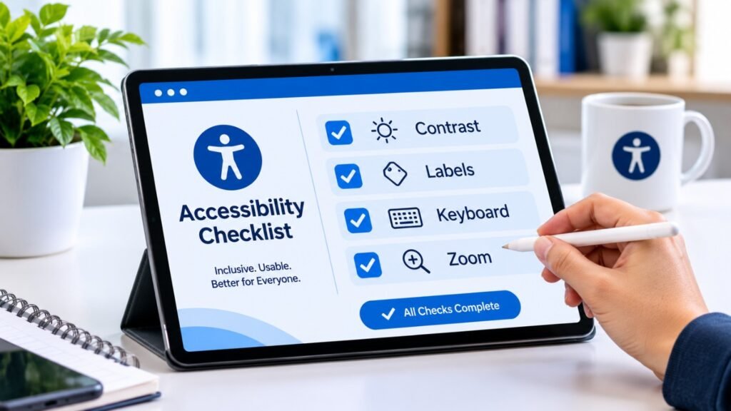
Use this as your working list for testing a website for accessibility and usability together.
Structure and content
- One clear H1 per page, with logical H2–H3 order
- Descriptive link text (no “click here”)
- Meaningful alt text on informative images
- Plain language and short paragraphs
Visual design
- Text contrast of at least 4.5:1
- Information not conveyed by color alone
- Visible focus indicators
- Readable font sizes
Interaction
- Everything works by keyboard
- Forms have visible, programmatic labels
- Error messages explain how to fix the problem
- No time limits that trap users
Experience
- Navigation is predictable
- Key tasks take few steps
- Mobile layouts hold up at 200% zoom
This checklist pairs well with your technical review. If you haven’t done one lately, use our technical SEO audit checklist. Clean headings, crawlable structure, and fast pages help both rankings and accessibility.
How Do You Score an Accessibility Audit With Numbers?
A score turns opinions into progress you can track. Here’s a simple 100-point scorecard.
| Category | Max Points | What You Check |
|---|---|---|
| Keyboard and focus | 20 | Tab order, traps, visible focus |
| Visual (contrast, zoom) | 15 | Ratios, 200% zoom, reflow |
| Structure and semantics | 15 | Headings, landmarks, labels |
| Forms and errors | 15 | Labels, validation, instructions |
| Media and documents | 10 | Captions, alt text, PDFs |
| Mobile and touch | 10 | Target size, orientation |
| Cognitive clarity | 10 | Plain language, consistency |
| Third-party tools | 5 | Widgets, embeds |
How to score: Give full points if a category passes on all key pages. Give partial points for partial passes. Zero for a blocker.
Rough bands:
- 85–100: Strong
- 65–84: Needs focused work
- Below 65: Real barriers exist
Re-score after each release. A rising number is a great story for your leadership team.
How Do You Test Keyboard Focus, Zoom, and Mobile Accessibility?
These three tests reveal the most with the least effort.
Keyboard focus order and focus management
Put your mouse away. Press Tab through the page.
Ask yourself:
- Can I see where focus is at all times?
- Does the order match the visual order?
- Can I open and close menus with the keyboard?
- Does focus move into a modal when it opens, and back when it closes?
A single keyboard trap can block a customer completely. It’s often the most urgent fix.
Screen magnification and browser zoom
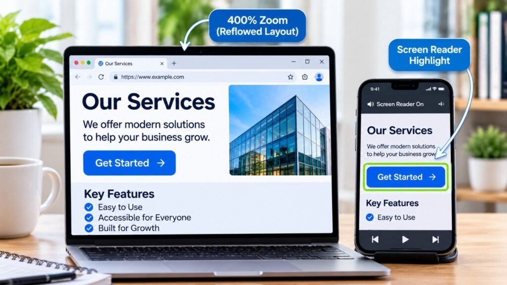
Zoom to 200%, then 400%. Content should reflow into one column without sideways scrolling.
Watch for clipped buttons, overlapping text, and sticky banners that swallow the screen.
Mobile accessibility testing for business websites
Many visitors are on phones, so test there.
- Turn on VoiceOver (iOS) or TalkBack (Android).
- Check touch targets. Aim for at least 24×24 CSS pixels, and bigger is kinder.
- Rotate the screen. Nothing should lock to one orientation.
- Test forms with the on-screen keyboard open.
If you also have an app, the same principles apply. Our mobile app development team builds with native accessibility APIs from day one.
Testing across browsers and devices
Don’t assume Chrome results match Safari. Test at least:
- Chrome, Safari, Firefox, and Edge
- One iPhone and one Android phone
- One screen reader pairing, such as NVDA with Firefox or VoiceOver with Safari
How Do You Evaluate Navigation and Reduce Cognitive Load?
This is where accessibility and UX truly merge.
Navigation and information architecture
Run a quick test. Ask five people to find your pricing, your contact page, and one product.
Then watch:
- Where do they hesitate?
- Do menu labels match their words?
- Is the current page clear in the navigation?
Keep menus consistent across pages. Limit top-level items to what people actually need.
Cognitive accessibility
Cognitive accessibility means lowering mental effort. It helps people with ADHD, dyslexia, anxiety, or simple exhaustion.
Quick wins:
- Write at an eighth-grade reading level
- Break tasks into small steps
- Avoid auto-playing carousels
- Let users review before submitting
- Don’t rush people with countdown timers
Honestly, this is the area most audits skip. It’s also where conversion gains often hide.
What Makes Forms, Booking Tools, and Checkout Accessible?
Forms are where money changes hands. They deserve extra attention.
Contact and appointment booking forms
- Every field has a visible label, not just placeholder text
- Required fields are marked in text, not just red color
- Error messages sit near the field and say what to do
- Date pickers work by keyboard
Ecommerce checkout and payment
- Guest checkout is available
- Autofill attributes are set correctly
- Payment errors are announced to screen readers
- Order summaries are readable at high zoom
- CAPTCHA has an accessible alternative
Pro tip: Complete your own checkout using only the keyboard. If you can’t finish in five minutes, neither can many customers.
Are Pop-ups, Widgets, and Embedded Content Accessible?
Often, no. And they’re added late, after the design work is done.
Pop-ups, modals, and notifications
A good modal:
- Moves focus inside when opened
- Traps focus until closed
- Closes with Esc
- Returns focus to the trigger
- Announces itself to screen readers
Toast messages need role=”status” or similar so updates are announced.
Third-party widgets
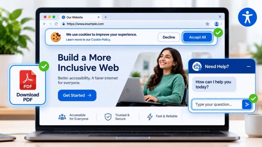
Chatbots, cookie banners, and booking tools are common offenders. You still own the experience, even if a vendor built it.
Ask vendors for their accessibility conformance report. Then test the widget yourself.
Embedded videos, maps, and external content
- Videos need captions and transcripts
- Autoplay should be off
- Maps need a text alternative, like an address list
- Test iframes for keyboard traps
PDFs and downloadable documents
PDFs are websites in disguise. Check for:
- Real text, not scanned images
- Tagged headings and reading order
- Alt text on images
- Fillable forms with labels
Often the better fix is publishing key info as a regular web page.
What Accessibility Problems Do WordPress, Multilingual Sites, and SPAs Have?
WordPress plugins and themes
Themes and plugins quietly add problems. Watch for:
- Sliders without pause controls
- Mega menus that trap focus
- Page builders producing empty headings
- Form plugins with missing labels
- Popup plugins ignoring focus
Test after every plugin update, not just at launch.
Multilingual websites
- Set the correct lang attribute on every page
- Mark language changes within a page
- Make sure language switchers are keyboard-friendly
- Check that right-to-left layouts keep logical focus order
- Test translated error messages, which are often missing
Dynamic content and single-page apps
SPAs change content without reloading. Screen readers may never know.
- Announce route changes
- Move focus to the new page heading
- Use live regions for updates
- Update the page title on each view
Our custom software development and UI/UX teams build these patterns into components, so they aren’t retrofitted later.
Should You Test With People With Disabilities?
Yes. It’s the single most humbling step.
Tools tell you what’s broken. People tell you what’s exhausting.
How to start small:
- Recruit 3–5 participants through disability organizations
- Pay them fairly for their time
- Give them real tasks, such as “book a call”
- Observe quietly and don’t coach
- Record issues and quotes
Five sessions can uncover patterns no scan ever will.
What Do Real Before-and-After Improvements Look Like?
Numbers help you set expectations. Here are two stories drawn from case-style write-ups.
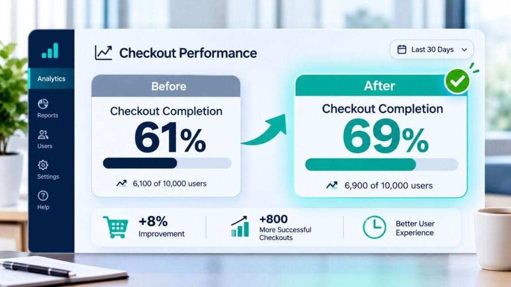
Story 1: The checkout that lost one in five buyers. I read about a mid-size online retailer with a 61% checkout completion rate. A review found unlabeled card fields, a low-contrast “Pay” button, and errors that appeared only in red. The team spent about three weeks fixing labels, contrast, and error text. Completion climbed to 69%. Support tickets about payment failures dropped by roughly a third.
Story 2: The booking form nobody could finish. A home-services firm saw 400 monthly form starts but only 90 submissions. Testing showed a date picker that couldn’t be used with a keyboard, plus a vague “Something went wrong” message. After replacing the picker and rewriting errors, submissions rose to 145 a month. It was the same traffic with fewer dead ends.
The lesson: Small, specific fixes beat big redesigns.
How Do Accessibility Issues Affect Conversions and Sales?
Every barrier is a tiny toll booth. Some visitors pay it. Many just leave.
Common leaks include:
- Low contrast hiding calls to action
- Forms that reject valid input silently
- Menus unreachable by keyboard
- Videos without captions in quiet places
Fix these and you’ll often see better SEO signals too. Cleaner structure, faster pages, and clearer content help search engines understand you. See how our SEO services connect with accessibility.
How do you measure UX improvements after fixing issues?
Track before and after:
- Conversion and form completion rates
- Task success in usability tests
- Bounce and exit rates on key pages
- Support ticket volume
- Your accessibility score
Compare 30-day windows around each release. Annotate your analytics so changes stay traceable.
How Do You Prioritize Issues? (Severity Matrix)
Not every bug deserves equal urgency. Use impact and reach.
| Severity | Definition | Example | Fix Window |
|---|---|---|---|
| Critical | Blocks a key task | Keyboard trap in checkout | 1–2 weeks |
| High | Major difficulty | Missing form labels | 2–4 weeks |
| Medium | Annoying but workable | Weak heading order | 1–2 months |
| Low | Minor polish | Redundant alt text | Next cycle |
Multiply severity by traffic. A medium bug on your homepage can outrank a high bug on a dead page.
How Much Does Accessibility Remediation Cost?
Costs vary by site size and complexity. These are typical US market ranges, so treat them as estimates and not quotes.
| Service | Typical Range (USD) | Best For |
|---|---|---|
| Automated scan + quick report | $500–$2,000 | Small sites, first look |
| Manual expert audit (10–20 pages) | $3,000–$10,000 | Most business sites |
| Audit + user testing | $8,000–$20,000 | High-risk or ecommerce |
| Remediation (development) | $5,000–$50,000+ | Depends on backlog |
| Monitoring retainer | $300–$1,500/month | Ongoing assurance |
Fixing during development is far cheaper than retrofitting. Plan it into the build.
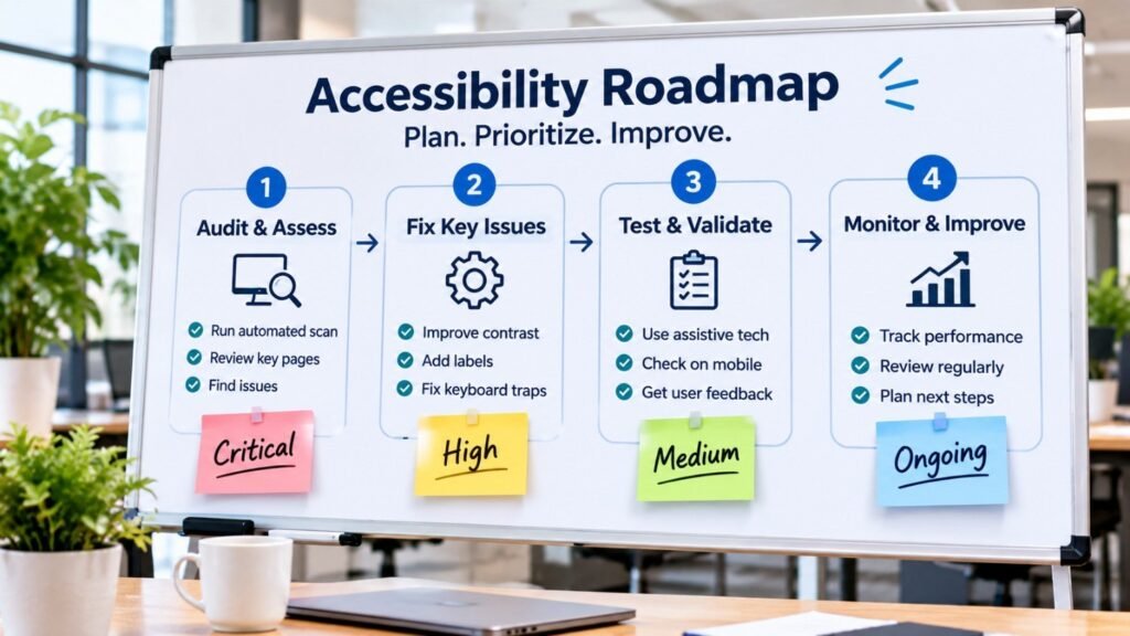
How Do You Build an Accessibility Remediation Roadmap?
Keep it simple and phased.
Phase 1 (Weeks 1–4): Stop the bleeding. Fix critical blockers on checkout, forms, and navigation.
Phase 2 (Months 2–3): Strengthen the core. Handle high-severity issues, templates, and shared components.
Phase 3 (Months 4–6): Polish and scale. Address medium issues, documents, and third-party tools.
Phase 4 (Ongoing): Maintain. Add checks to every release.
Assign an owner to every item and a date to every owner.
What should an accessibility audit report include?
Use this template:
- Executive summary with score and top risks
- Scope and method (pages, tools, devices)
- Findings table: issue, WCAG criterion, severity, page, screenshot
- Recommended fix in plain language
- Roadmap with owners and dates
- Retest plan
A report people can act on beats a 200-page PDF nobody reads.
Who Owns Accessibility, and How Do You Keep It From Slipping?
Assigning responsibilities
Accessibility fails when it belongs to “everyone,” which means no one.
- Designers: contrast, focus states, component patterns
- Developers: semantic code, keyboard support
- Content writers: headings, alt text, plain language
- QA: accessibility test cases
- Product owner: budget and accountability
Monitoring after redesigns and updates
Redesigns reset progress. Schedule a scan after every major release. Use automated monitoring weekly and manual spot checks quarterly. Teams exploring AI development are now using AI to flag missing alt text and reading-level issues, though a human still reviews the results.
Preventing future problems
- Add accessibility to your design system
- Include acceptance criteria in every ticket
- Train your team once a year
- Test prototypes before development
- Add automated checks in your CI pipeline
Accessibility statements and feedback
Publish a short statement. Include your standard (WCAG 2.2 AA), known gaps, and a real contact method. Then actually respond to feedback within a few business days. It builds trust and often surfaces issues for free.
Best for the US: Region-Specific Considerations
US businesses face a clear legal backdrop.
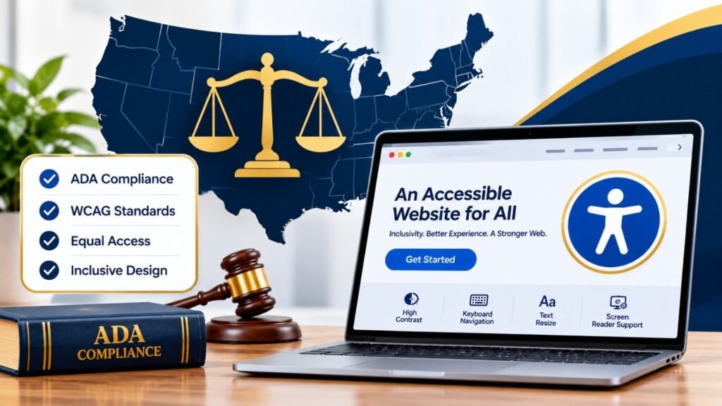
- ADA Title III: Courts regularly treat business websites as public accommodations. WCAG is the common yardstick in demand letters and lawsuits.
- DOJ Title II rule (April 2024): State and local governments must meet WCAG 2.1 AA. In April 2026, DOJ pushed the deadlines back one year: April 26, 2027 for entities serving 50,000+ people, and April 26, 2028 for smaller ones. So 2027 is a real turning point if you sell to government, and you should expect this language in contracts.
- Section 508: Federal procurement requires accessible digital products.
- State laws: California’s Unruh Act adds statutory damages, which makes California-facing sites a frequent target.
US challenges: Serial demand letters hit small ecommerce stores hard. Overlay widgets alone have not protected many businesses. Real fixes matter more.
Practical US budget: A small business can often complete an audit plus critical fixes for $5,000–$15,000. That’s usually far less than defending a single claim.
This isn’t legal advice. Talk to a qualified attorney about your exposure.
How often should I check website accessibility?
Run automated scans weekly and a manual review every quarter. Always retest after redesigns, plugin updates, or new checkout features. Treat it like security patching, not a one-time project.
Can a free tool tell me if my site is compliant?
No. Free scanners find a minority of issues. They can flag a missing label but can’t judge whether your checkout makes sense. Use them as a smoke detector, not a verdict.
Do accessibility overlay widgets fix everything?
Rarely. Overlays can add their own keyboard and screen-reader problems. Fixing the underlying code is more reliable, and it’s what most legal and expert guidance favors.
What’s the fastest accessibility win for a small business?
Fix your top three: color contrast, form labels, and alt text. Those same issues dominate the WebAIM data. A weekend of focused work can remove a large share of errors.
Does accessibility help SEO?
Often, yes. Clear headings, descriptive links, alt text, and fast, stable pages help both users and crawlers. Accessibility isn’t a ranking factor by name, but the overlap is strong.
Is AI-generated alt text good enough?
It’s a decent first draft. AI misses context, like why an image matters on your page. Review every suggestion, especially for product and instructional images.
How long does a business website audit take?
A focused audit of 10–20 pages typically takes one to three weeks. Add time for user testing and for writing the roadmap.
What if I can’t afford to fix everything at once?
Don’t. Prioritize critical journeys first, publish an accessibility statement, and show steady progress. A documented, funded plan is much stronger than doing nothing.
Conclusion
You now have a complete way to check website accessibility without getting lost. Start with the scan, move to keyboard, zoom, and mobile, then test real journeys. Score the results. Rank the issues. Fix the ones that block people first.
Don’t wait for a complaint or a legal letter. Every fixed label, every readable button, and every clearer menu helps real people buy from you. Pick one journey this week, run the checklist, and write down your score. That’s the hardest step, and you’ve already begun.
Ready to grow your business with custom AI, SEO, web development, or digital marketing?